Usability
The streamlined design allow HCP to understand patient’s condition effectively
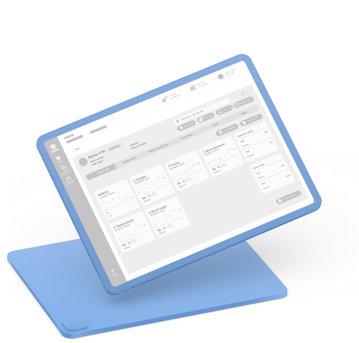

Without regular in-person appointments, there’s a lack of structure for the teams of healthcare professionals (HCPs) to take care of multiple patients. They will need to manage messages and meetings with patients as well as internal communications.

The current communications are scattered across the platform and important messages get lost. There’s an opportunity to facilitate regular and effective communication between patients and HCPs while calling out of any emergencies to ensure HCP can provide the care the patient needs.
Remote health consulting helps both the patient and HCPs to save money and time. Its demand has increased after the pandemic, especially among elderlies and patients in the care home, who have no choice but to avoid all hospital visits.
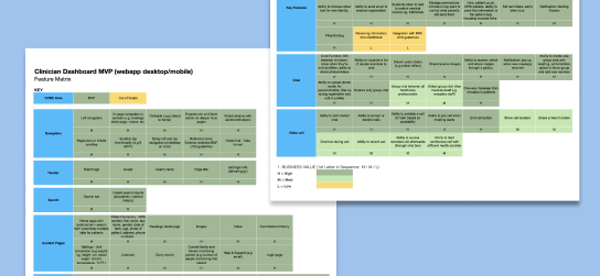
We followed up our initial product discussion with a feature matrix that captures all the features that are in and out of scope. We have also colour-coded the features by priority to form a product road map.
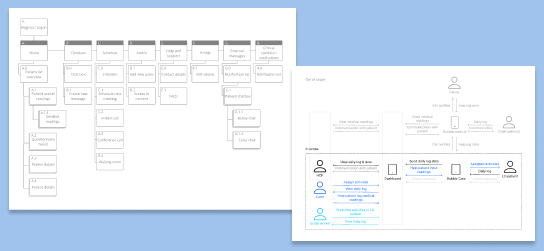
Through regular design reviews with our client who is also a GP, we improved the design to best meet the HCP’s need: to get to critical information quickly to take the right actions.
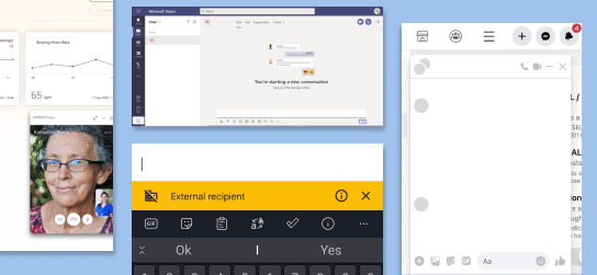
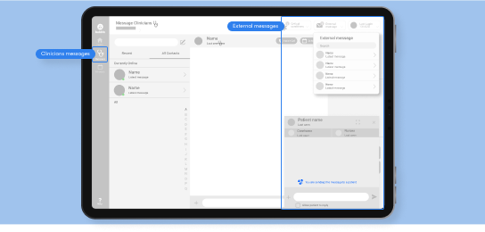
To steer clear of any danger of sending messages to the wrong chat, which might cause serious and unintended consequences to the patient, we considered ways of separating the HCP-HCP and HCP-patient chat box.
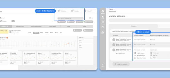
We’ve implemented 2 features to direct the HCP’s attention to what matters:
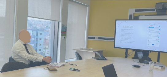
Due to budget and time constraints, we didn’t get to interview multiple HCPs to understand the problem they face during remote consultation. Luckily for us, our client is one of the users himself so we were still able to get some level of insight to inform the design.
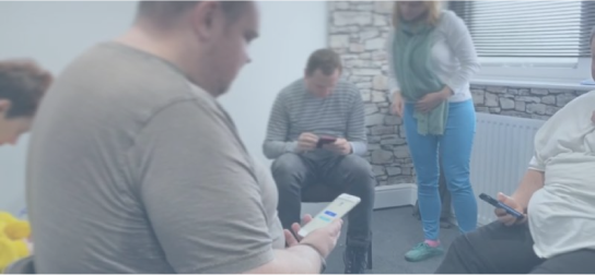
Again for the same reasons, we didn’t get to conduct any structured usability testing, but our client took the time to share the prototype with his connections and we still got useful insights that way.
The streamlined design allow HCP to understand patient’s condition effectively
The dashboard design allows clinicians to quickly scan the necessary information
The clients delighted by the end result and were able to get more funding with the prototype
After the UI design and development phase, the product is now in the hands of HCPs
Some contributing factors to the project running smoothly are the in-depth initial discussions on the project expectation, sufficient communication between iterations, and the requirements being well documented.
Crypto currency investment platform & wallet for beginners