Developed and Launched
Handed annotated wireframes over to the development team


Because of the jargon, unfamiliar concepts, and inflexible interfaces, tracking the profit gains or losses gets confusing for beginners. There is an opportunity to simplify it for the users and hand-hold the users through onboarding.

To use Coin Rivet, the users need to also sign in to a separate partner platform called Luxon Pay due to how they are set up. To overcome this potential barrier for the users, we need to make the experience as seamless as possible for the user.
We worked as a design team of 2 along with the project managers and product owner

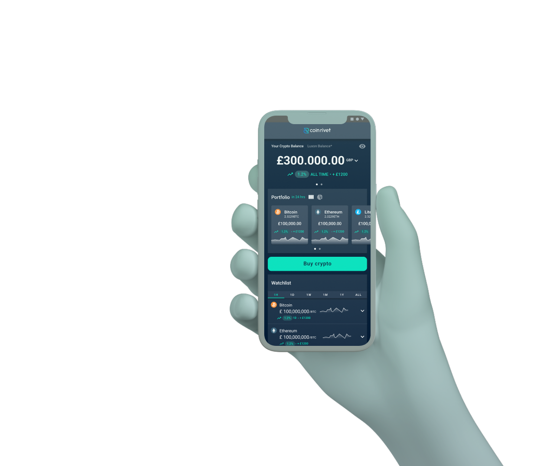
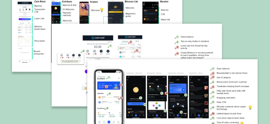
To understand what’s industry standard, we started by looking at a bunch of competitors. We notice there are big opportunities for nurturing onboarding, comprehensive support, intuitive data visualisation, and simple actions. All these findings help us define the app’s navigation structure and the dashboard’s information architecture.

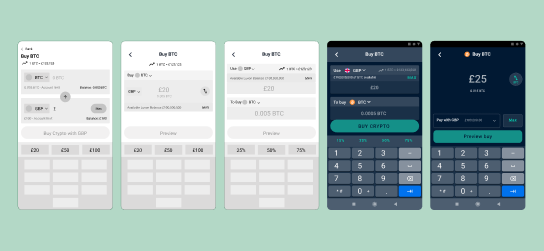
There are many variables when displaying portfolio growth or transferring cryptocurrencies. To make the screens easy to understand and aesthetically pleasing, we needed to limit the overwhelming options while allowing users to be in control when using the product.
Due to the multi-step integration with the partner platform Luxon Pay, there are some hoops that the users need to jump through before being able to invest in cryptocurrency or cash out. Mapping out all the possible scenarios help us make sure the users won’t get stuck at any point in the journey.
By only displaying information that is relevant to the user’s action at that point, we managed to optimised the information for the users' actions:
We provided a clear title and a progress bar for the different stages in the onboarding process to explain why certain actions are not available to them. Sign posting and error messages are also used in any blockers that they face to indicate the next steps that they could take.
We came up with ways to streamline the signup process and provide more support to the users but due to the tight timeline of launching an MVP, they can’t be implemented. They are recorded in the backlog and will be picked up again once the MVP is tested and revisited.
Due to the pressure to launch Beta soon, we didn’t get the chance to run structured user testing. Instead, we did short informal user interviews to understand the pain points and confusion they have in the cryptocurrency world.
Handed annotated wireframes over to the development team
The app has picked up traction and is used by beginners
Users commented on the ease of use and efficiency
Being able to consult that development team from the wireframe stage helped ensure the designs are feasible and made the handover process smoother. Understanding their capabilities also gave us the freedom to create within the constraints.
With multiple people working on the same project, we needed to map out the work streams to ensure we are being efficient with time while still being aligned on the project.
Package-free groceries delivery service for time poor users